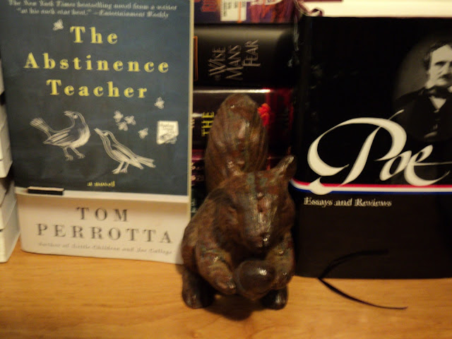
I just returned from a visit to my favorite used bookstore, McKay's in Nashville, and I thought instead of just posting a couple of pictures of the books' spines that I would have a sort of cover art "contest" to see which books are more visually appealing to you. In these photos, a cast-iron squirrel shall be like blind Justice; it stands between the two books, trying to decide which one out of the two in each of these eight photos is more attractive visually. Want to judge along with the squirrel? Just say left or right for each of the eight photos. Curious to see which are more appealing to readers here.
Left: Ignazio Silone, Fontamana. Right: Jacques Audiberti, le cavalier seul
Left: Elena Poniatowska, Querido Diego, te abraza Quiela. Right: Silvina Ocampo, Cornelia frente al espejo.
Left: Robert Coover: A Night at the Movies: Or, You Must Remember This. Right: Vladimir Nabokov, King, Queen, Knave.
Left: Tom Perrotta, The Abstinence Teacher. Right: Poe: Essays and Reviews (Library of America edition).
Left: Rubén Mendoza, Lotería and Other Stories. Right: Rafael Alberti, Sobre los ángeles/Yo era un tanto y lo que he visto me ha hecho dos tontos.
Left: Thomas Mann, Die Erzählungen: Band 1. Right: Heinrich der Löwe, Der verbinderte König.
Left: Voltaire, Candide. Right: Anouilh, Antigone.
Left: Camilo José Cela, Tobogán de hambrientos. Right: Mariano Azuela, Los de abajo.
I think the squirrel is having a more difficult time choosing than it expected. Was it easier for you?


No comments:
Post a Comment